Image Editing
A Book Cover
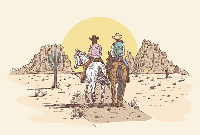
For my book cover I chose to redesign my favorite novel, the Pulitzer Prize winning Lonesome Dove by Larry McMurtry. This is the third book in the Lonesome Dove tetralogy, and is an epic adventure and love story from the days of cowboys and indians. It follows two Texas Rangers and a group of cowboys as they travel from Texas to Montana.
I wanted to keep the concept simple. I used a sketch style drawing of two cowboys on horse back moving along a path towards a sunset as the primary visual.
A gradient overlay provides the appearance of the sun setting to the entire cover, letting the early evening sky and the dust of the trail provide the overall color scheme. I changed the gradient's layer style to multiply which allowed the primary image background color and my gradient's colors to blend together for a harmonious scheme.
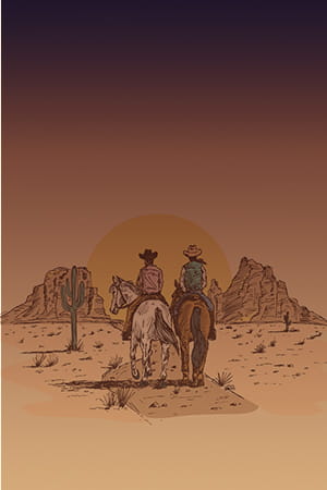
Next, I added a sprinkle of stars and adjusted the layer style and opacity to give the appearance that the stars are more visible at high points in the sky and less visible closer to the setting sun.
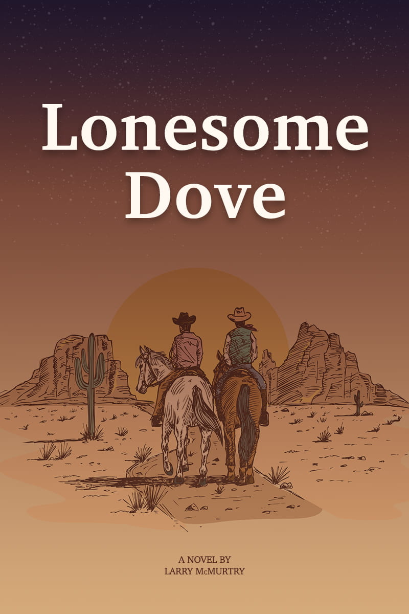
I used a classic, serif typeface for the title and author information, with a slight touch of the dusty brown layered on top of the title which helps to tone down the white text the slightest bit. Here is the final image.
A Logo
I developed two different logo concepts for this assignment. The first is for a fictitious fitness program called Mean Green Fitness. The original inspiration for the concept came from my son, who was stomping around the house pretending to be the Incredible Hulk. He told me he likes Hulk because he's strong and green.
I did some image searching online and found a few versions of the Hulk's angry eyes that I thought looked awesome, so I decided to base the logo concept off of the intense Hulk eyes.

Mean Green Fitness
For the logo to be successful, it had to feel angry like the Hulk. Since the Hulk is green, I went with mean as an adjective for the obvious bonus of the rhyme with mean. I added in the some circles for eyes with angry eye brows to try and pull the angry Hulk eye concept into the logo.
The bold letters and angry eyes create a feeling of power, which I hope would make the fitness program feel like it was going to be intense and force you to be strong. I shaded the word green to be bright and bold, again strong with a goal of standing out while being linked to the Hulk's angry green color, which was the original inspiration.
Once I was happy with the primary version, I worked out a smaller version that could be used for social media.
Finally, I reversed the colors for a version that works on a dark background.
Overall I was very happy how this concept turned out. I think it looks and sounds mean, the green color pops well on both light and dark backgrounds, and the angry eyes convey the power from the original inspiration point.
A Second Logo
My wife saw the logo, and reminded me that she needed logo help for a business she started a little over a year ago called the River Bend Art Company. She does custom wood working and all types of art projects, and she wanted a logo that felt classic but that did not include an icon or image. The name is linked to the fact that we live in a river town, a few miles away from the Delaware River.
River Bend Art Company
This time I started with the smaller logo, because her initial concern was that her current logo didn't stand out on social media threads and that it looked weak and difficult to read. My goal was to use the letters R and B as the primary visuals, and to somehow use negative space between the letters to create the effect of the bend in a river or stream.
I did a follow up version that uses only the R and B, ideal for icons in a social media stream where the smaller words would be illegible.
I'm not sure if I totally pulled off the negative space creating the shape of a river bend, I think it's subtle enough that it will be recognized, but the R and B alone stand out strong enough on their own to be a success. After I was happy with the small versions, I worked out the full size logo that included all of the brand.
For colors, I consulted various articles online related to design trends for 2021. Repeatedly I found notes that 2021 will feature a draw back from bright colors and the focus will shift to dimmed colors, where instead of adjustments to brightness and contrast, black and white will be added to the primary color to build popular pallets.
Early design awards mentioned the following combinations as stand outs:
- sea blue and mint
- mustard and beige
- black and lime
- pink and secret moss
- black and red scarlet
- soft green and white
I tried all of these combinations, and variations of each, but ultimately my wife chose the color scheme she preferred (a prefect blend of "the client is always right", mixed with "happy wife, happy life").
Once color was settled, I integrated the color scheme into all of the other versions of the logo.
Overall I am happy with the outcome. I think both versions are much strong, and the issue of not standing out properly in a social media feed has been addressed.